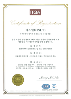
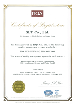
Company
CI & Certificate
SLT is a company that dreams of becoming a success story!
We would like to contribute to make a better tomorrow.
CI Symbol symbol mark
SLT Story
As the design that marks SLT, it was designed to be modern and ignorant
by using simple Gothic fonts.
It is raised to the step-down graphic point in the stroke of the alphabet S,
which contains the meaning of development.
This means continued growth and development for the company, and it also marks
the challenge by pointing to the top graphic in red color.
Main color is navy color with additional weights.


CI Element Component

Basic

Gray

Black


CI Color Dedicated color

RGB : R 109  G 110  B 113
CMYK : C 0   M 0   Y 0   K 70

RGB : R 11  G 63  B 126
CMYK : C 100   M 80   Y 10   K 20

RGB : R 237  G 27  B 49
CMYK : C 0   M 100   Y 88   K 0


Quality certificate (ISO 9001:2008)


19, Seongseogongdannam-ro 32-gil, Dalseo-gu, Daegu, Korea   |  TEL : +82-53-583-1720  |  FAX : +82-53-583-1721  |  CEO : Lee Jinhui
COPYRIGHT ¨Ï 2017 SLT. ALL RIGHTS RESERVED.